AIPA Holdings Dashboard
AIPA Holdings Dashboard
AIPA Holdings Dashboard
Designing an investor dashboard for streamlined financial reports
Designing an investor dashboard for streamlined financial reports
Designing an investor dashboard for streamlined financial reports
End-to-end Product Design
End-to-end Product Design
End-to-end Product Design
User Research
User Research
User Research
FinTech
FinTech
FinTech


project Background
project Background
project Background
Overview
Overview
Overview
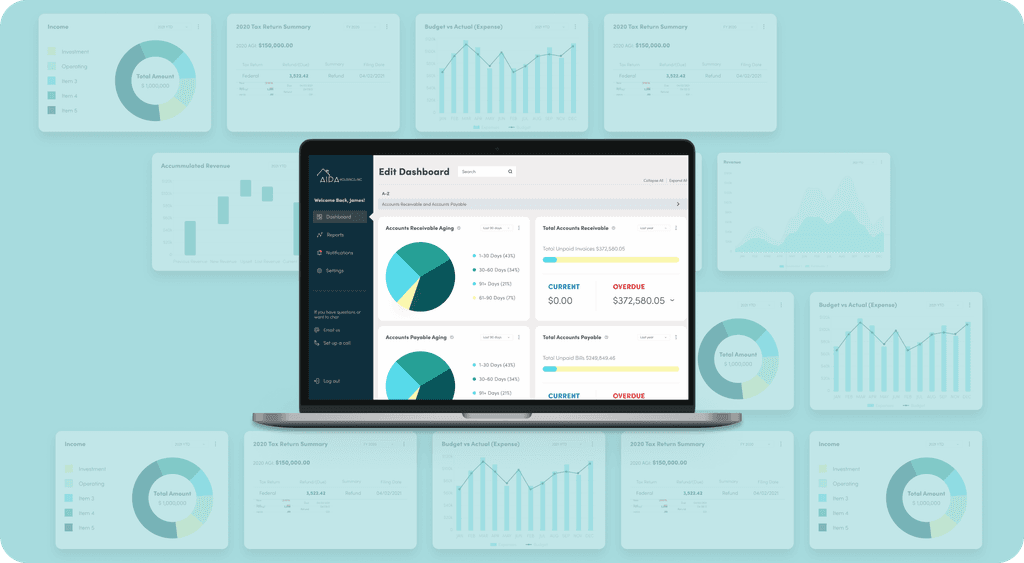
I designed an investor dashboard for TLNH Consultants, a business services firm, simplifying complex financial data into clear, actionable insights.
By focusing on usability and intuitive design, I created a dashboard that helps users quickly access key information, making financial decision-making more straightforward.
Role
Role
Role
Product Design
Product Design
Product Design
Research
Research
Research
Prototyping
Prototyping
Prototyping
Outcome
Outcome
Outcome
Dashboard MVP
Dashboard MVP
Dashboard MVP
Team
Team
Team
Design Lead
Design Lead
Design Lead
Product Owner
Product Owner
Product Owner
Developer
Developer
Developer
Type
Type
Type
Freelance Project
Freelance Project
Freelance Project
The goal was to design an experience that makes financial data less daunting and more empowering for everyone, from accountants to small business owners.
The goal was to design an experience that makes financial data less daunting and more empowering for everyone, from accountants to small business owners.
The goal was to design an experience that makes financial data less daunting and more empowering for everyone, from accountants to small business owners.
Challenges
Challenges
Challenges
01
01
01
TLNH has a broad user base, where everyone has varying needs and levels of expertise.
TLNH has a broad user base, where everyone has varying needs and levels of expertise.
TLNH has a broad user base, where everyone has varying needs and levels of expertise.
02
02
02
Users found it challenging to navigate through lengthy reports to extract relevant insights.
Users found it challenging to navigate through lengthy reports to extract relevant insights.
Users found it challenging to navigate through lengthy reports to extract relevant insights.
research
research
research
User Research
User Research
User Research
I needed to improvise while conducting research since we did not have a budget to incentivize participants.
I needed to improvise while conducting research since we did not have a budget to incentivize participants.
Privacy agreements with TLNH's customers also prevented me from connecting with them directly.
Privacy agreements with TLNH's customers also prevented me from connecting with them directly.
Overcoming Research Constraints
Overcoming Research Constraints
Overcoming Research Constraints
With limited access to TLNH’s customers and a tight budget, I developed a flexible research strategy to gather valuable insights. By combining three complementary methods, I ensured the design process stayed grounded in real user needs.
With limited access to TLNH’s customers and a tight budget, I developed a flexible research strategy to gather valuable insights. By combining three complementary methods, I ensured the design process stayed grounded in real user needs.
With limited access to TLNH’s customers and a tight budget, I developed a flexible research strategy to gather valuable insights. By combining three complementary methods, I ensured the design process stayed grounded in real user needs.
01
01
Client-Assisted User Feedback
Client-Assisted User Feedback
Client-Assisted User Feedback
Since direct access to users wasn’t possible, I crafted open-ended questions for TLNH to ask their customers.
This helped uncover real challenges while respecting confidentiality agreements.
Since direct access to users wasn’t possible, I crafted open-ended questions for TLNH to ask their customers.
This helped uncover real challenges while respecting confidentiality agreements.
Since direct access to users wasn’t possible, I crafted open-ended questions for TLNH to ask their customers.
This helped uncover real challenges while respecting confidentiality agreements.
02
02
Anonymous Surveys
Anonymous Surveys
Anonymous Surveys
I launched an anonymous survey targeting users of similar products in the market.
This helped identify common frustrations and expectations within the business services industry.
I launched an anonymous survey targeting users of similar products in the market.
This helped identify common frustrations and expectations within the business services industry.
03
03
Personal Network Interviews
Personal Network Interviews
Personal Network Interviews
To add depth, I conducted interviews with individuals in my personal network who fit the target user profile.
These conversations provided context and helped validate emerging design directions.
To add depth, I conducted interviews with individuals in my personal network who fit the target user profile.
These conversations provided context and helped validate emerging design directions.
Findings
Findings
60%
Felt overwhelmed by data and want to only track metrics relevant to them.
Felt overwhelmed by data and want to only track metrics relevant to them.
85%
Wanted simplified methods to access their financial data.
Wanted simplified methods to access their financial data.
40%
Desire concise summaries alongside detailed reports.
Desire concise summaries alongside detailed reports.
Overview of user needs
Overview of user needs
01
01
Users want content being presented as simply as possible since financial reports are already complex
Users want content being presented as simply as possible since financial reports are already complex
02
02
Users are interested in looking at the performance of an investment, by days, months or years.
Users are interested in looking at the performance of an investment, by days, months or years.
02
02
Users need help figuring out what information to look at on the report, and what to do with the information.
Users need help figuring out what information to look at on the report, and what to do with the information.
03
03
Easy export options if they wanted to share reports.
Easy export options if they wanted to share reports.
Who are we designing for?
Who are we designing for?
My research revealed two key user types: those who preferred detailed financial data and those who needed simplified summaries. Designing the information architecture meant balancing these needs to ensure both groups could easily access relevant insights.
My research revealed two key user types: those who preferred detailed financial data and those who needed simplified summaries. Designing the information architecture meant balancing these needs to ensure both groups could easily access relevant insights.
My research revealed two key user types: those who preferred detailed financial data and those who needed simplified summaries. Designing the information architecture meant balancing these needs to ensure both groups could easily access relevant insights.
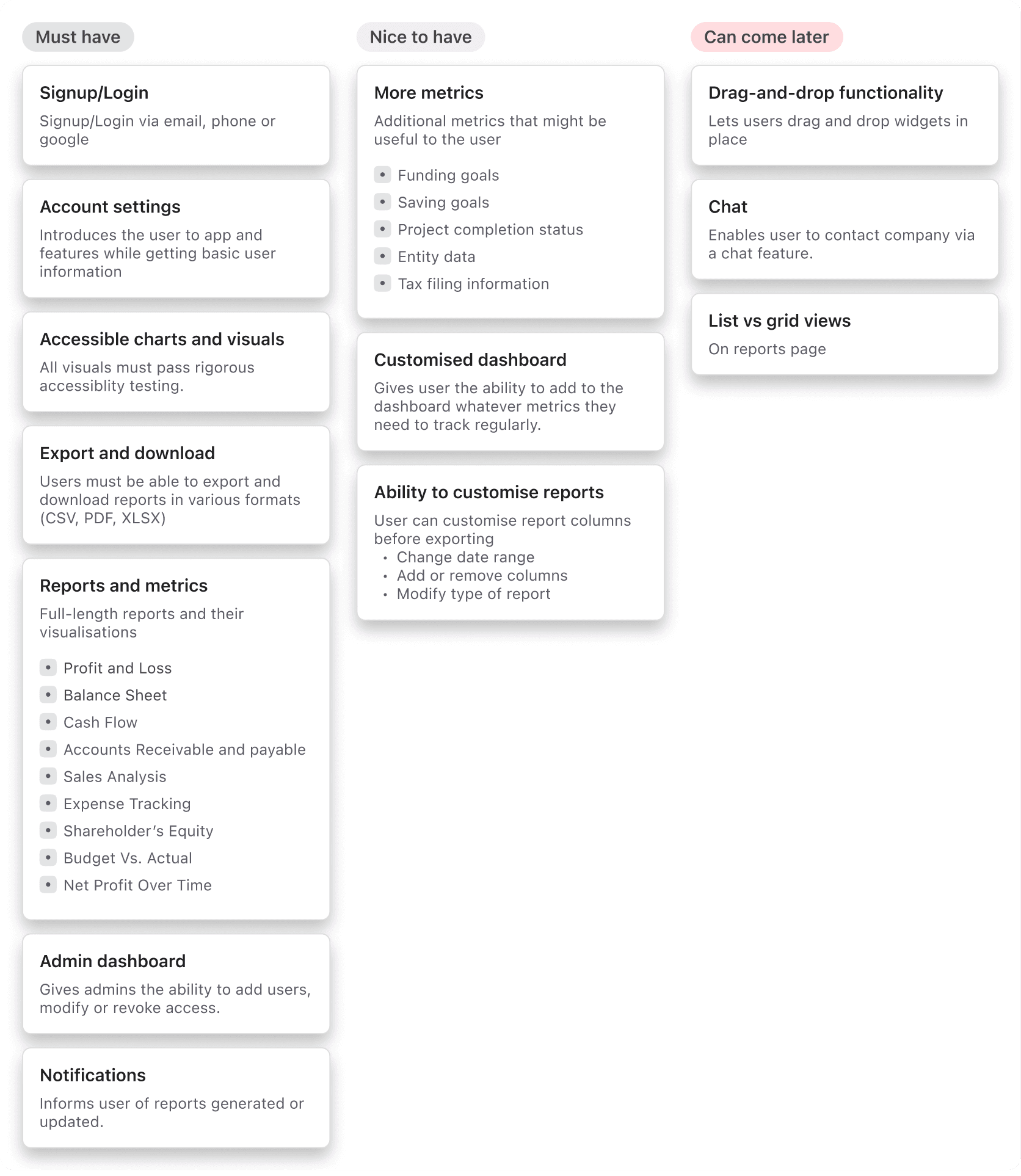
User Needs - Feature Prioritization
For a complex project with a range of functionality, it was important to prioritize features for the MVP and work from there
For a complex project with a range of functionality, it was important to prioritize features for the MVP and work from there
For a complex project with a range of functionality, it was important to prioritize features for the MVP and work from there


Problem Statement
Problem Statement
Problem Statement
How might we simplify complex financial data into clear, actionable insights while accomodating users with varying levels of financial expertise?
How might we simplify complex financial data into clear, actionable insights while accomodating users with varying levels of financial expertise?
How might we simplify complex financial data into clear, actionable insights while accomodating users with varying levels of financial expertise?
ideation & design
ideation & design
ideation & design
Data visualization
Data visualization
Data visualization
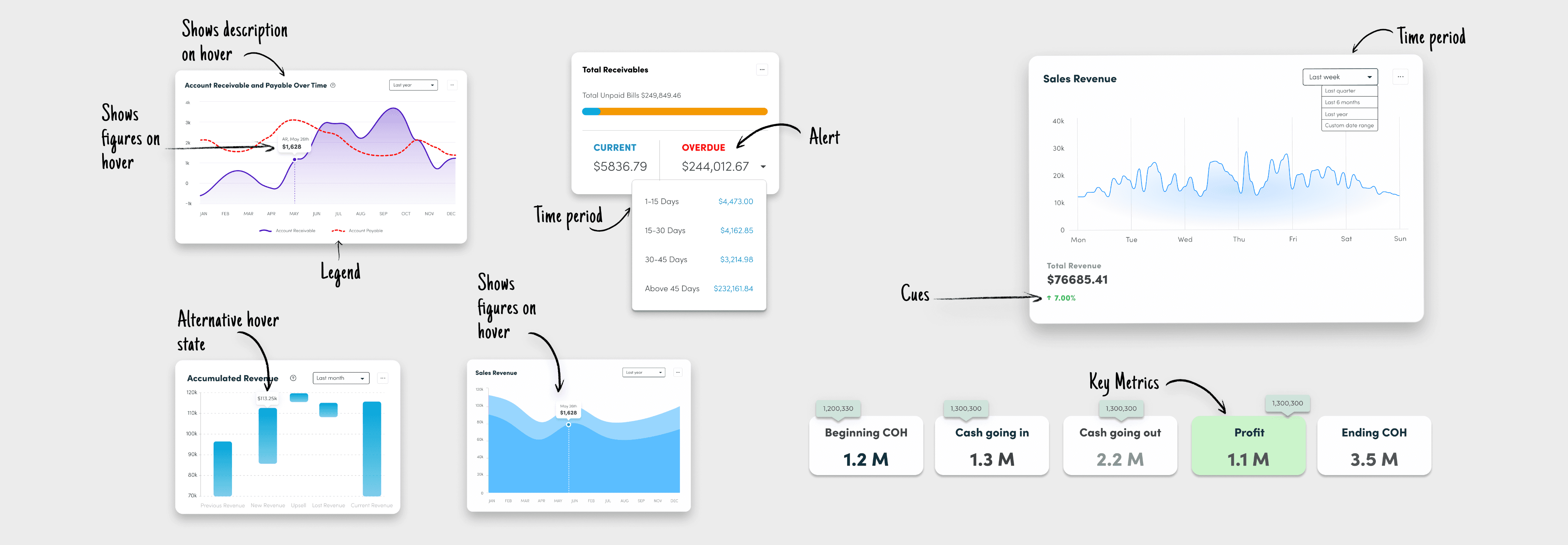
I transformed complex financial reports into clear, meaningful visuals that users could quickly interpret.
The goal was to help beginners grasp key insights without feeling overwhelmed, while still giving experts the depth they needed to make informed decisions.


Reports
Reports
Reports
I transformed complex financial reports into clear, meaningful visuals that users could quickly interpret.
I transformed complex financial reports into clear, meaningful visuals that users could quickly interpret.
I transformed complex financial reports into clear, meaningful visuals that users could quickly interpret.
The goal was to help beginners grasp key insights without feeling overwhelmed, while still giving experts the depth they needed to make informed decisions.
The goal was to help beginners grasp key insights without feeling overwhelmed, while still giving experts the depth they needed to make informed decisions.
The goal was to help beginners grasp key insights without feeling overwhelmed, while still giving experts the depth they needed to make informed decisions.


Wireframing
Wireframing
Wireframing
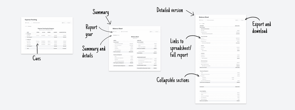
With key user needs and design goals in mind, I created wireframes to define the dashboard’s layout and functionality.
With key user needs and design goals in mind, I created wireframes to define the dashboard’s layout and functionality.
With key user needs and design goals in mind, I created wireframes to define the dashboard’s layout and functionality.
The focus was on organizing complex financial data into a clear, intuitive structure that balances detailed reports with easy-to-understand summaries.
The focus was on organizing complex financial data into a clear, intuitive structure that balances detailed reports with easy-to-understand summaries.
The focus was on organizing complex financial data into a clear, intuitive structure that balances detailed reports with easy-to-understand summaries.


High-fidelity design
High-fidelity design
High-fidelity design
Version 1
Version 1
Version 1
Dashboard
Dashboard
Dashboard
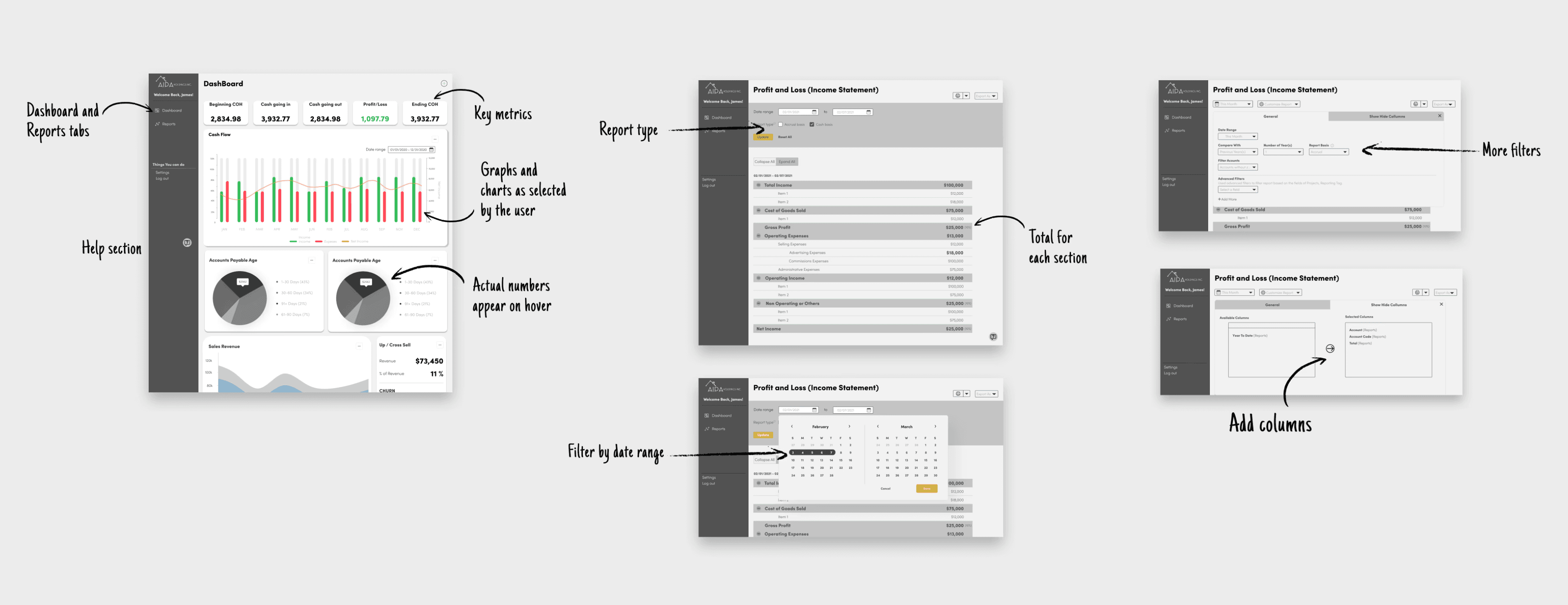
On logging in, the users land on a dashboard containing some preset metrics.
On logging in, the users land on a dashboard containing some preset metrics.
On logging in, the users land on a dashboard containing some preset metrics.
The user has the option to customise the dashboard to track whichever metrics are important to them.
The user has the option to customise the dashboard to track whichever metrics are important to them.
The user has the option to customise the dashboard to track whichever metrics are important to them.
Reports
Reports
Reports
The Reports section allows the user to view hard data and numbers driving the dashboard metrics.
The Reports section allows the user to view hard data and numbers driving the dashboard metrics.
The Reports section allows the user to view hard data and numbers driving the dashboard metrics.
Additionally, users can view custom ranges and even download the report for further processing
Additionally, users can view custom ranges and even download the report for further processing
Additionally, users can view custom ranges and even download the report for further processing
Testing & iteration
Testing & iteration
Testing & iteration
Usability Testing
Usability Testing
Testing with both novice and expert users helped uncover key areas for improvement. Feedback guided design refinements, ensuring the dashboard stayed intuitive while meeting a wide range of user needs.
Testing with both novice and expert users helped uncover key areas for improvement. Feedback guided design refinements, ensuring the dashboard stayed intuitive while meeting a wide range of user needs.
Overview of test findings
Overview of test findings
01
01
"I'm not sure which page I'm on"
"I'm not sure which page I'm on"
02
02
"I didn't know I could customize the dashboard"
"I didn't know I could customize the dashboard"
02
03
Users need help figuring out what information to look at on the report, and what to do with the information.
Users need help figuring out what information to look at on the report, and what to do with the information.
03
Easy export options if they wanted to share reports.
Easy export options if they wanted to share reports.
Fixes and changes
Fixes and changes
Improving Edit and Search findability
Improving Edit and Search findability
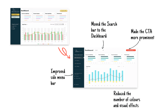
Usability testing revealed visual clutter and navigation friction.
Usability testing revealed visual clutter and navigation friction.
I improved clarity by reducing colors and visual effects, relocating the search bar for better accessibility, and enhancing the CTA’s prominence.
I improved clarity by reducing colors and visual effects, relocating the search bar for better accessibility, and enhancing the CTA’s prominence.


Enhanced navigation and information hierarchy
Enhanced navigation and information hierarchy
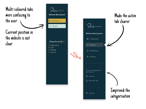
Users found the multi-colored tabs confusing and struggled to identify their current location on the site.
Users found the multi-colored tabs confusing and struggled to identify their current location on the site.
I simplified the design by highlighting the active tab clearly and improving categorization, making navigation more intuitive and reducing cognitive load.
I simplified the design by highlighting the active tab clearly and improving categorization, making navigation more intuitive and reducing cognitive load.


Making adding columns to a report more intuitive
Making adding columns to a report more intuitive
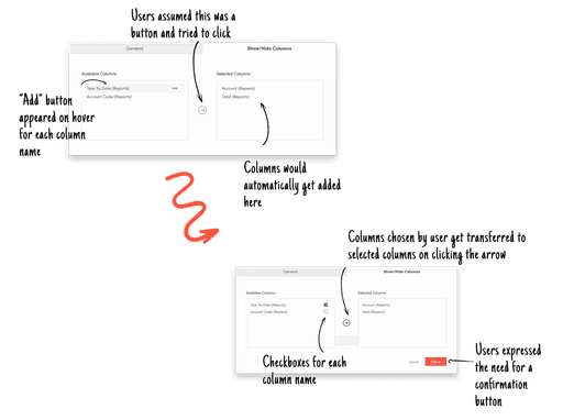
Usability testing revealed confusion around hidden “Add” buttons and unclear interactions.
Usability testing revealed confusion around hidden “Add” buttons and unclear interactions.
Usability testing revealed confusion around hidden “Add” buttons and unclear interactions.
I replaced the hover-based buttons with visible checkboxes and added a confirmation button, making the process clearer and easier to use.
I replaced the hover-based buttons with visible checkboxes and added a confirmation button, making the process clearer and easier to use.


Version 2
Version 2
Through usability testing and feedback, the design was refined to make navigation clearer and actions more intuitive.
Through usability testing and feedback, the design was refined to make navigation clearer and actions more intuitive.
Key improvements, like relocating the search bar, simplifying visuals, and enhancing customization, helped streamline workflows and make the interface easier to use.
Key improvements, like relocating the search bar, simplifying visuals, and enhancing customization, helped streamline workflows and make the interface easier to use.
CONCLUSION
Project outcome
Project outcome
The project wrapped up with a well-documented handoff to the development team, ensuring the designs were ready for smooth implementation.
The project wrapped up with a well-documented handoff to the development team, ensuring the designs were ready for smooth implementation.
I delivered clear, actionable assets that simplified collaboration and set the foundation for a user-friendly dashboard.
I delivered clear, actionable assets that simplified collaboration and set the foundation for a user-friendly dashboard.
01
01
Interactive Prototype
Interactive Prototype
A fully functional prototype showcasing the final design, complete with detailed user flows for both novice and expert user paths.
A fully functional prototype showcasing the final design, complete with detailed user flows for both novice and expert user paths.
02
02
Detailed Handoff Documentation
Detailed Handoff Documentation
Included site architecture, user flows, and style guides to support developers and minimize back-and-forth during implementation.
Included site architecture, user flows, and style guides to support developers and minimize back-and-forth during implementation.
03
03
Streamlined Collaboration
Streamlined Collaboration
Organized reports and notes ensured cross-functional alignment, enabling developers and project managers to move forward confidently.
Organized reports and notes ensured cross-functional alignment, enabling developers and project managers to move forward confidently.
Reflection and personal growth
Reflection and personal growth
Adapting to Constraints with User-Centered Focus
Adapting to Constraints with User-Centered Focus
I learned to design under real-world challenges—limited research access, tight resources, and diverse user needs—by creating flexible research strategies that still prioritized the user experience.
I learned to design under real-world challenges—limited research access, tight resources, and diverse user needs—by creating flexible research strategies that still prioritized the user experience.
Navigating Cross-Functional Collaboration
Navigating Cross-Functional Collaboration
Working closely with developers, business managers, and product owners taught me the importance of balancing user needs, technical feasibility, and business goals while maintaining open communication.
Working closely with developers, business managers, and product owners taught me the importance of balancing user needs, technical feasibility, and business goals while maintaining open communication.
Thriving in a Global Team
Thriving in a Global Team
Collaborating across time zones with teammates from around the world pushed me to stay organized, resilient, and proactive—skills I’m proud to carry forward into future projects
Collaborating across time zones with teammates from around the world pushed me to stay organized, resilient, and proactive—skills I’m proud to carry forward into future projects